
Discover why minimalism in design boosts creativity and effectiveness. Learn the cognitive science behind powerful, focused design choices.
Minimalism in design is one of the most misunderstood concepts in creative work. Ask ten designers to define it and you will likely hear “white space,” “clean lines,” or “simple layouts.” Those answers are not wrong, but they barely scratch the surface of why minimalism in design produces such consistently powerful results. The real answer lives deeper, in cognitive science, communication theory, and a disciplined approach to decision-making that shapes every element on the page. Once you understand the genuine mechanics behind it, minimalism stops feeling like a style choice and starts feeling like the most logical way to design anything.
Table of Contents
- Key Takeaways
- Foundational principles of minimalist design
- Why minimalism works: the cognitive science
- Common pitfalls in minimalist design
- Applying minimalism across design disciplines
- My take on minimalism’s enduring power
- Bring minimalist thinking to your space
- FAQ
Key Takeaways
| Point | Details |
|---|---|
| Minimalism is a framework | Every design element must earn its place by clarifying or reinforcing communication. |
| Cognitive load drives results | Reducing visual noise frees users’ working memory, speeding task completion and reducing errors. |
| Hick’s Law is your ally | Fewer choices mean faster decisions, directly improving conversion rates and user satisfaction. |
| Pitfalls are real | Empty design without purpose is not minimalism. Hierarchy and warmth must still be present. |
| Application is disciplined | Use progressive disclosure, role separation, and controlled palettes to maintain depth and clarity. |
Foundational principles of minimalist design
Most people trace minimalism in design back to a single phrase: “less is more.” It sounds simple enough. But the philosophy behind it took decades to harden into something designers could actually use as a working method.
The Bauhaus movement, which began in Germany in 1919, laid the groundwork by rejecting decoration for its own sake. Bauhaus designers believed that form should follow function, meaning every visual decision had to serve a purpose beyond looking attractive. That idea carried forward into the mid-twentieth century, when Dieter Rams became the most articulate spokesman for minimalist design principles. His work at Braun and Vitsoe produced products that looked effortless precisely because every superfluous element had been removed. Rams did not pursue simplicity for elegance. He pursued it because Rams’ ten principles prioritize function and the removal of unnecessary elements above everything else.
That distinction matters enormously. Minimalism as Rams practiced it is not about aesthetic preference. It is a decision-making framework, and the core question it asks is ruthless: does this element earn its place by clarifying or reinforcing communication? If the answer is no, the element should be removed. That question applies equally to a button on a mobile app, a headline on a poster, a cabinet handle in a kitchen, and a product on a shelf.
The key principles worth internalizing are these:
- Simplicity of form: Shapes, lines, and structures should be stripped to their most direct expression of purpose. Complexity should only appear when it genuinely aids comprehension.
- Functional clarity: Every element has a job. A label, a divider, a color field. Each should perform that job with precision and nothing more.
- Controlled palette: Color choices in minimalist work are deliberate and limited. Each color carries specific meaning or directs attention. Decorative color is removed.
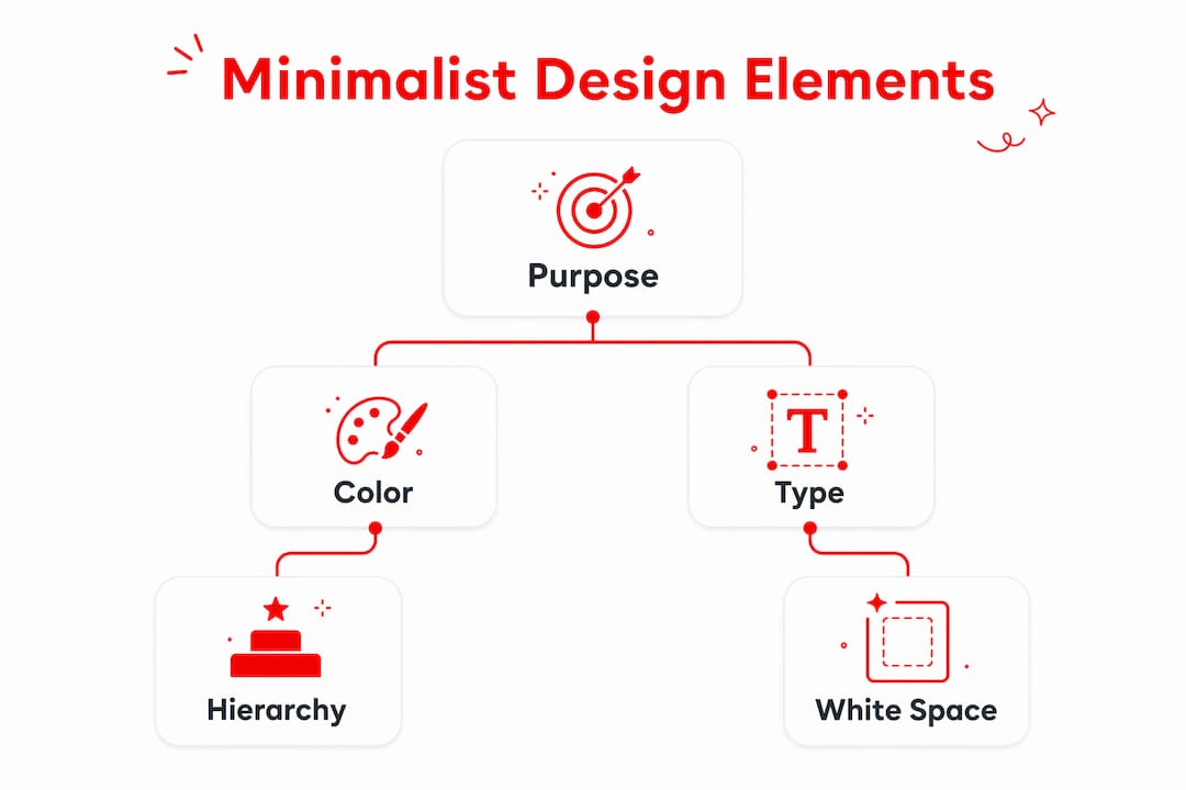
- Deliberate negative space: White space is not empty. It creates breathing room that guides the eye, groups related content, and signals what matters most on the page.
The difference between true minimalism and what you might call “cosmetic minimalism” comes down to intention. Cosmetic minimalism looks stripped back but has no communication hierarchy behind it. True minimalism removes everything that does not serve the user while preserving everything that does. The resulting design often feels effortless to the viewer, even though it required far more rigor to produce than a complex layout would have.
Pro Tip: Before removing any element from a design, ask yourself what job it is doing. If you cannot name a specific communication goal it serves, it almost certainly does not belong there.
Why minimalism works: the cognitive science
Here is where things get genuinely fascinating. The reason why minimalism in design produces better results is not aesthetic preference. It is wired into how the human brain processes visual information.
Cognitive Load Theory explains that minimalism reduces extraneous mental effort, freeing users’ working memory for key tasks. Working memory is the mental space where active thinking happens, and it is surprisingly limited. When a design fills the screen with competing visual elements, decorative textures, and ambiguous icons, it consumes working memory just to parse what is there. By the time the user is ready to act, they are already mentally fatigued. A minimalist interface removes that tax entirely.
Hick’s Law puts a mathematical model on this phenomenon. Decision time increases logarithmically with the number of choices available. Every menu item, every navigation option, every call-to-action you add to a page slows the user down. The relationship is not linear, it compounds. Double the options and you do not double the decision time. You increase it at a rate that accelerates with each addition. This is why minimalist navigation consistently outperforms complex navigation, not because it looks better, but because it literally produces faster, more confident decisions.
The data backs this up clearly:
| Metric | Cluttered design | Minimalist design |
|---|---|---|
| Processing speed | Baseline | 30% faster |
| Form conversion rate (11 fields) | Baseline | 160% increase at 4 fields |
| Usability issues identified | Harder to detect | 75% found with 3-5 evaluators using heuristics |
| Task completion rate | Lower with visual noise | Higher with clear role separation |
Jakob Nielsen’s usability heuristics have long supported this. The tenth heuristic explicitly calls for aesthetic and minimalist design, recommending that interfaces contain no irrelevant or rarely needed information because every extra unit of information competes with the relevant ones.
“Every additional element in a design competes with the relevant ones for the user’s attention. Minimalism does not remove depth. It removes the noise that obscures depth.” — Usability principle in practice
Minimalist UI with fewer elements and clear role separation results in faster task completion, lower error rates, and easier maintenance. For product designers working on digital interfaces, this is not a soft benefit. It is measurable, repeatable, and defensible to clients and stakeholders.
Common pitfalls in minimalist design
Knowing why minimalism works is one thing. Avoiding the traps that trip up even experienced designers is another challenge entirely. The most common mistake professionals make is treating minimalism as removal without purpose.
Empty design happens when designers take away visual complexity but forget to preserve communication hierarchy. The result feels cold and confusing. Users cannot find what they need because there are no clear visual cues guiding them. The irony is that empty design often frustrates users more than cluttered design does, because at least cluttered design gives them something to search through.
Here are the most frequent pitfalls worth watching for:
- Removing hierarchy along with clutter: When you reduce elements, you must simultaneously strengthen the remaining visual signals. Weight, scale, and contrast need to do more work with fewer components.
- Cosmetic minimalism without function: Designing something to look minimal while hiding important controls or information in places users cannot find produces a frustrating experience dressed in clean clothes.
- Ignoring warmth and personality: Minimalism does not require sterility. Texture, illustration, custom typography, and thoughtful micro-interactions can bring character to minimal work without adding visual noise.
- Neglecting role separation: Functional clarity demands that each element has a single, clear purpose. When one element tries to serve multiple roles, minimalist design breaks down because the user cannot quickly interpret what they are looking at.
Managing depth is where progressive disclosure becomes your most powerful tool. Rather than surfacing every possible option or detail at once, progressive disclosure hides rarely needed information behind hover states, expandable sections, and secondary tabs. The interface stays clean for casual users while power users can still access everything they need.
Pro Tip: Test your minimalist design by covering the screen and uncovering it for three seconds. If a new user cannot identify the primary action within that time, your hierarchy needs strengthening, not more elements.
Applying minimalism across design disciplines
Theory is only valuable when it translates into what you actually do on a project. The beauty of minimalist design principles is that they apply across graphic design, UI and UX, product design, and spatial design with consistent logic. The execution differs but the framework is the same.

A stepwise decision framework
Before you add or keep any element in a design, run it through these questions in order:
- Does this element communicate something the user needs to accomplish their goal?
- If yes, is it communicating that thing in the simplest possible form?
- Does it conflict with or dilute any other element already present?
- If it is informational but rarely needed, can it be revealed through progressive disclosure instead?
- Does removing it create confusion, or does it clarify the design?
This framework prevents the common failure mode where designers remove elements intuitively but without a system, leaving designs that feel arbitrary rather than refined.
Color, typography, and white space in practice
Color is one of the most immediate ways to signal minimalist discipline. Limiting a palette to two or three colors forces every color choice to carry specific meaning. A single accent color directs attention better than five colors competing for priority. Typography in minimalist work should be chosen for legibility and character, because minimalism exposes every design element and sloppy type choices become impossible to hide.
White space is the tool that separates amateur minimalism from professional work. Generous spacing between elements does not just look elegant. It groups related content, creates visual rhythm, and signals importance through proximity and isolation.
Digital interfaces vs. product design: a quick comparison
| Context | How minimalism applies | Key technique |
|---|---|---|
| Mobile UI | Reduce navigation options, surface primary action | Progressive disclosure, Hick’s Law |
| Web design | Limit form fields, strengthen visual hierarchy | Role separation, controlled palette |
| Product design | Remove non-functional features, simplify form | Rams’ subtraction principle |
| Spatial design | Use negative space, limit material variety | Functional clarity, deliberate scale |
Looking at real-world examples makes these distinctions concrete. Think about the difference between a cluttered e-commerce checkout with twelve fields and a stripped-back one with four. Research shows that reducing form fields to four can produce a 160% increase in conversion rates. That is not a design preference. It is a business result delivered by minimalist principles.
Chunking works alongside progressive disclosure to manage complexity without sacrificing depth. Breaking large decision tasks into sequential smaller ones reduces cognitive load and speeds navigation. Instead of presenting twenty product filters at once, you present five categories and let users drill down. The experience feels lighter even though the functionality is identical.
For those exploring how minimalism applies specifically to web design and development, the principles translate directly into page speed, navigation clarity, and user engagement metrics. Fewer elements mean faster load times, and faster load times mean better retention.
When you bring minimalism to graphic design, the rules around typography and hierarchy become even more pronounced. Every typeface choice, every weight variation, every point of space between lines must serve the communication goal. There is no decoration to fall back on. That constraint is challenging and liberating in equal measure.
My take on minimalism’s enduring power
I have spent years watching designers approach minimalism as a trend rather than a discipline, and the results are almost always the same: beautiful screenshots, frustrating user experiences.
What I have learned is that minimalism is genuinely demanding work. It is far easier to add another element to solve a communication problem than to remove something and solve the problem with what remains. The courage to keep cutting, even when a design already feels clean, is what separates minimalism that works from minimalism that merely looks good in a portfolio.
I have also seen how the field has matured. Early digital minimalism often felt cold and clinical. The best contemporary minimalist work carries warmth through custom illustration, thoughtful animation, and type choices that feel human. These additions do not contradict minimalist principles because they earn their place by serving the user emotionally. Function includes feeling.
The single lesson I keep returning to: minimalism reveals everything. There is nowhere to hide a weak idea behind visual complexity. If the design works without decoration, the idea itself is strong. That is the real reason why choosing minimalism is such a rigorous, rewarding practice.
— Alexander
Bring minimalist thinking to your space
Minimalist principles do not stop at the screen. The same logic behind reducing visual noise and prioritizing function applies to physical spaces, home design, and everyday environments. Stripping back unnecessary decoration and focusing on purposeful, beautiful elements transforms how a space feels and functions. If you are inspired to apply these principles beyond your design work, explore home improvement upgrades that enhance comfort through simplicity. For a hands-on approach to minimalist aesthetics at home, the DIY home decor guide offers practical steps to create stunning, streamlined spaces. The philosophy is the same: keep what earns its place, remove what does not.
FAQ
What is minimalism in design, really?
Minimalism in design is a decision-making framework where every element must justify its presence by serving a specific communication goal. It is not about emptiness or aesthetics but about removing anything that does not help the user accomplish their task.
How does minimalism improve usability?
Minimalism reduces cognitive load by eliminating competing visual elements, allowing users to process interfaces 30% faster and make decisions more quickly. Fewer choices and clearer hierarchy directly lower error rates and increase task completion.
What is the difference between minimalism and empty design?
Empty design removes elements without preserving communication hierarchy, leaving users confused and without clear visual cues. True minimalism removes only what does not serve the user while strengthening the remaining elements to carry more meaning.
How do I use progressive disclosure in minimalist design?
Progressive disclosure hides rarely needed information behind expandable sections, hover states, or secondary screens so the primary interface stays clean. This technique lets casual users work without distraction while giving power users access to deeper functionality when they need it.
Why do minimalist forms convert better?
Reducing form fields directly removes decision points and friction for the user. Research shows that cutting fields from eleven to four can produce a 160% increase in conversion rates because each removed field eliminates a moment of hesitation or effort.


















Leave a Comment
Your email address will not be published. Required fields are marked with *