
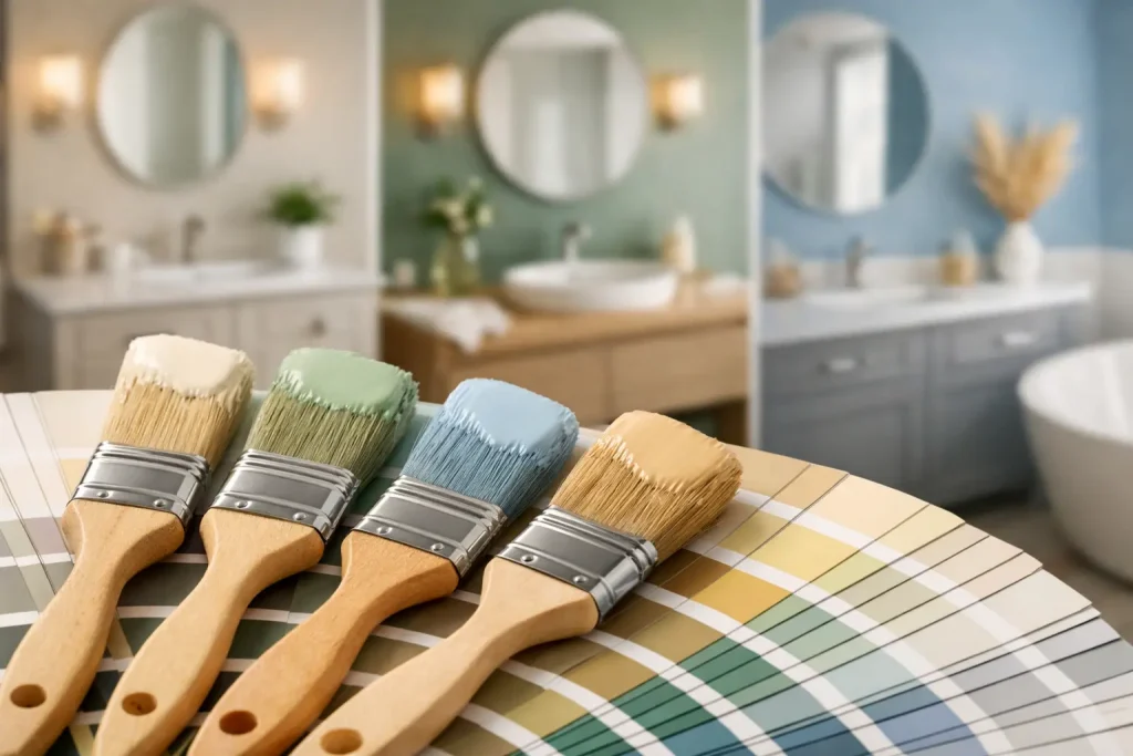
Find the best paint colors for bathrooms, from warm whites to moody blues, with practical tips for light, tile, size, and paint finish selection choices.
A bathroom can look newly renovated after a weekend of painting – or strangely smaller, colder, and more cluttered than it did before. The best paint colors for bathrooms do more than follow a trend. They work with the room’s light, fixed finishes, and the feeling you want at the start and end of each day.
Because bathrooms are usually compact and filled with permanent materials like tile, countertops, and vanities, color choices carry extra weight. A sample that looks fresh in a bright store can turn gray beside creamy tile, or feel far too intense under a single overhead light. Start with what is already staying, then choose a shade that makes those elements look intentional.
Best Paint Colors for Bathrooms by Mood
Warm white for a clean, flexible backdrop
Warm white is one of the safest choices for bathrooms because it creates a clean look without the stark, clinical feel that a pure bright white can bring. Look for whites with soft cream, beige, or very subtle pink undertones if your bathroom has warm tile, brass fixtures, wood cabinetry, or beige stone.
This is an especially smart route for smaller bathrooms with limited daylight. The walls will reflect available light and make the room feel more open, while leaving plenty of room to introduce personality through towels, art, hardware, and a colorful shower curtain. Be cautious with very yellow whites, though. In a windowless bath with warm bulbs, they can look dingy rather than inviting.
Soft gray for a polished, modern look
A light gray bathroom can feel calm, tailored, and easy to update. The trick is choosing the right undertone. Gray with a slight warmth pairs well with marble-look tile, greige flooring, and brushed nickel. A cooler blue-gray may work beautifully with crisp white tile but can feel icy when the room has little natural light.
Before committing, hold a large paint sample next to the tile and vanity at different times of day. Gray is famously changeable. What looks like a balanced neutral in morning light may appear lavender, blue, or green after sunset.
Pale blue for a fresh, spa-like bathroom
Pale blue remains a strong bathroom color for good reason. It suggests water and sky without requiring a coastal theme. A misty blue with gray undertones creates a quiet, spa-inspired effect, especially beside white porcelain, chrome, and natural wood accents.
Choose a muted version rather than a bright baby blue if you want the color to feel current. Dusty blue is forgiving in bathrooms that do not get much sun, while blue-green shades can add more personality without overwhelming a small footprint. Pair them with warm white trim or light oak to keep the space from feeling chilly.
Sage green for softness with personality
Sage has become a go-to for homeowners who want color that still behaves like a neutral. It works with white subway tile, black accents, aged brass, warm wood, and many stone finishes. In a bathroom, the effect is relaxed and grounded rather than overly decorative.
The best sage shades are usually softened with gray or a touch of yellow. If the room has cool gray tile, choose a sage with more gray in it. If you have warm travertine, cream walls elsewhere, or brass fixtures, a slightly warmer olive-sage will look more connected. Very pale green can read almost neutral, making it a practical option for resale-minded updates.
Deep navy for drama in the right space
Dark paint is not off-limits in a small bathroom. In fact, a deep navy can make a powder room feel deliberate, cozy, and high-end. It is particularly effective when paired with a white vanity, bright mirror, brass hardware, or patterned floor tile.
The trade-off is that dark walls absorb light. Use navy when you have adequate lighting or are willing to add it, and consider painting the ceiling and trim a lighter shade for contrast. A full bath used for makeup or shaving may benefit from brighter walls, but a guest powder room is a great place to take a bolder risk.
Charcoal and near-black for a dramatic powder room
Charcoal, inky green, and near-black shades can turn a plain half bath into a memorable space. These colors work best when the room has an intentional lighting plan: a bright vanity fixture, warm bulbs, and a mirror that helps reflect light around the room.
A dark powder room does not need to feel cave-like. Crisp white trim, a light ceiling, reflective fixtures, and a pale counter can create enough contrast to keep the effect sharp. If black feels too severe, try a charcoal with brown undertones or a dark forest green.
Match Bathroom Paint to What You Cannot Change
Paint is comparatively inexpensive, so it should usually follow your tile, countertop, and vanity rather than fight them. Identify whether your fixed finishes lean warm, cool, or neutral before bringing home swatches.
Warm materials include cream tile, tan stone, honey oak, and brass. They tend to work best with warm white, greige, muted green, or a softened blue. Cool materials such as bright white tile, gray marble, chrome, and blue-gray flooring can support cool white, blue-gray, soft green, or charcoal. If the bathroom mixes materials, choose a balanced neutral such as a warm white or gentle greige that does not exaggerate the mismatch.
Undertones matter more than the color name on the paint chip. Two colors both labeled “white” may look completely different once they meet a cream bathtub or a gray quartz counter. Buy sample pots or peel-and-stick samples, place them beside the permanent finishes, and look at them in morning, afternoon, and evening light.
How Lighting Changes Bathroom Color
Bathroom lighting is often harsher and more limited than lighting in the rest of the house. A north-facing window can make colors appear cooler, while warm artificial bulbs can pull beige, yellow, and red undertones forward. That means the best-looking swatch under store lighting is not necessarily the winner at home.
Use the actual vanity lights when testing colors. If the room has no window, test samples with the door closed and the lights on. You are choosing paint for the way the bathroom is normally used, not for the brief moment when sunlight happens to spill in from the hallway.
For a more flattering and versatile result, many bathrooms benefit from bulbs around 2700K to 3000K. The exact choice depends on the desired look, but extremely cool bulbs can make warm paint look dull and skin tones look washed out.
Choose the Right Sheen for Moisture and Cleanup
Color gets most of the attention, but finish affects how the walls perform. Bathrooms need paint that stands up to steam, splashes, and frequent cleaning. A quality bathroom-rated paint with mildew resistance is worth considering, particularly in a shower-heavy family bath or a room with weak ventilation.
Satin is a popular middle ground because it has a slight sheen, wipes clean easily, and does not highlight every wall imperfection. Semi-gloss offers stronger moisture resistance and is common on trim, doors, and cabinets, though its shine can reveal uneven drywall. Matte or flat finishes can look sophisticated, but choose a washable formula and avoid them in bathrooms that stay humid for long periods.
A Quick Color Plan for Small Bathrooms
Small bathrooms do not have to be white, but they do benefit from visual continuity. Painting walls and trim in related light shades can reduce hard visual breaks and make the room feel more expansive. If you want a deeper color, use it on all walls for a jewel-box effect rather than stopping at one random accent wall.
Keep the ceiling in mind, too. A standard white ceiling helps lift the room, while a ceiling painted the wall color can make a tall powder room feel more enveloping. In a low-ceilinged full bath, lighter is usually the safer choice.
The winning bathroom color is the one that looks good at 7 a.m., holds up to steam, and makes the tile you already own look like part of the plan. Test generously, check the undertones, and let the room’s daily use make the final call.


















Leave a Comment
Your email address will not be published. Required fields are marked with *