

Unlock your political beliefs with insightful tests! Discover the nuances of your views using the Political Compass and FindMyPolitics.
For a nuanced, multi-axis result, start with FindMyPolitics. For a fast classic quadrant placement, go straight to The Political Compass. Both are free, take under 15 minutes, and show your results the moment you finish.
Here’s where to start right now:
- The Political Compass — Classic two-axis grid; best for a quick, shareable quadrant dot. Typically takes a short amount of time to complete.
- FindMyPolitics — Five-axis, balanced question set with contextual notes; best for deeper self-study. Short version runs about 10 minutes; the 80-question deep version takes roughly 20.
- IdeologyMap — Five independent axes with country and ideology comparisons; best for cross-cultural perspective. Choose 30, 50, or 80 questions.
- Votely — Three-axis model with a 3D-cube visualization and 81 ideology matches; best for a visually striking, slider-based experience.
- Pew Research Political Typology Quiz — Multi-group U.S. typology; best for understanding where you fit in the American political landscape specifically.
Results pages vary. The Political Compass shows a dot on a 2D grid. FindMyPolitics and IdeologyMap display bar charts across multiple axes. Votely renders a 3D cube. Pew gives you a named group profile with detailed context.
Key Takeaways
Multi-axis political compass tests consistently reveal more about your values than classic two-axis versions, making them the better starting point for genuine self-reflection.
| Point | Details |
|---|---|
| Start multi-axis, then classic | Take FindMyPolitics or IdeologyMap first, then run The Political Compass for a quick reference quadrant. |
| Answer instinctually | First reactions produce more reliable results than carefully considered policy positions. |
| Privacy varies by test | FindMyPolitics and IdeologyMap use in-browser scoring; always check before you start. |
| Cross-test comparison matters | Significant differences between two tests usually point to question framing effects, not inconsistency in your views. |
| Results are a starting point | Use scores to prompt reflection and conversation, not as fixed political labels. |
Table of Contents
- How do political compass tests measure your ideology?
- Comparing the main online political compass tests
- How to take a political compass test and get a meaningful result
- Reading your score: what your quadrant actually tells you
- How reliable are these quizzes, really?
- Which political compass test fits your goal?
- Our team’s perspective on using these tests well
- Sources
How do political compass tests measure your ideology?
Every political alignment test works by converting your answers into scores along one or more axes. An axis is simply a spectrum between two opposing values, and the key insight of multi-axis testing is that different axes are largely independent of each other. Your economic views don’t automatically predict your social views.
The classic two-axis model, best illustrated by The Political Compass, uses:
- Economic axis (Left–Right): How much should markets be regulated or controlled? Left favors collective or state management; Right favors free markets and private ownership.
- Social axis (Authoritarian–Libertarian): How much authority should government or institutions hold over personal life? Authoritarian favors hierarchy and order; Libertarian favors personal freedom and decentralized power.
More advanced tools add axes such as:
- Civil liberties: Protection of individual rights against state or majority overreach.
- Governance style: Preference for direct democracy, technocracy, or representative systems.
- System trust: Confidence in existing institutions versus populist skepticism of them. This axis is particularly useful because it separates someone who distrusts government and wants less of it from someone who distrusts government but still wants it to solve problems.
Questions are typically written as propositions rather than policy questions. You respond on a scale from “Strongly Agree” to “Strongly Disagree.” The wording is often deliberately abstract.
“If economic globalisation is inevitable, it should primarily serve humanity rather than the interests of trans-national corporations.”
This is a typical Political Compass proposition. Notice it does not ask about a specific policy. It probes a value instinct.
Your responses map to numeric scores on each axis. Some tests report raw coordinates (e.g., Economic: +2.3, Social: -1.8). Others convert scores to percentiles, showing where you land relative to other test-takers. Visualization types range from a simple 2D dot on a grid to multi-bar charts, radar diagrams, and Votely’s interactive 3D cube.
Comparing the main online political compass tests
The Political Compass remains the most widely recognized political ideology quiz online. Its two-axis grid is easy to share and instantly recognizable, which is why it dominates social media discussions. The limitation is real: two axes can cluster a large share of respondents in the Libertarian Left quadrant, obscuring meaningful differences between people who share coordinates but hold very different views on governance or civil liberties.
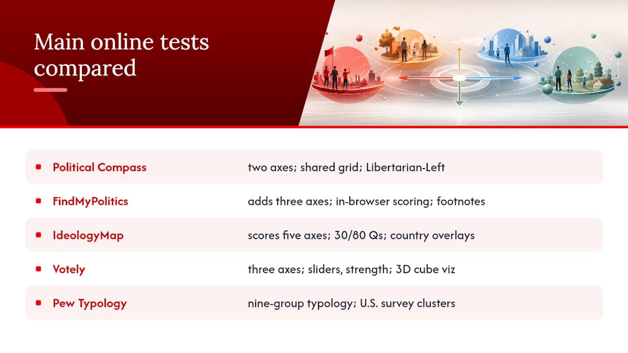
FindMyPolitics was built explicitly as a response to those limitations. It adds three axes to the classic pair, offers contextual footnotes on ambiguous questions, and runs its scoring in-browser so your answers don’t leave your device. Best for: anyone who wants a more textured picture of their political beliefs.
IdeologyMap scores five independent axes and then overlays your profile against countries and historical ideological figures. The 30-question quick version is genuinely fast; the 80-question deep version produces a richer profile. Best for: readers curious about how their views compare internationally.
Votely uses sliders rather than radio buttons, which lets you express the strength of a view, not just its direction. The 3D cube visualization is striking and makes it easy to see how three axes interact. An optional paid report expands the ideology analysis. Best for: visual thinkers who want to see their views in three dimensions.
Pew Research’s Political Typology Quiz classifies you into one of nine named groups grounded in U.S. survey data. It’s less a compass and more a typology, which means it tells you who you’re like rather than where you sit on a grid. For understanding the American political landscape specifically, it’s the most grounded option available.
How to take a political compass test and get a meaningful result
Getting a stable, honest result comes down to a few habits that most people skip.
- Answer instinctually. Test designers write propositions to trigger gut reactions, not policy analysis. Your first response is usually more revealing than a considered one.
- Use your current feelings as the baseline. Don’t answer based on who you want to be politically. Answer based on how you actually feel right now.
- Avoid socially pressured answers. If you’re taking the test with friends or in a group setting, the temptation to perform a certain identity is real. Take it alone for the most honest result.
- Don’t skip questions. Neutral or “Agree” defaults on hard questions flatten your scores and reduce the test’s ability to distinguish your views.
Privacy checklist before you start:
- Does the test ask for your email? (The Political Compass and IdeologyMap do not require one.)
- Is scoring done in-browser or server-side? (FindMyPolitics and IdeologyMap advertise in-browser computation, meaning your answers aren’t transmitted.)
- Does the test share results publicly or link them to a profile? (Most free tests do not; Votely’s paid tier stores extended report data.)
Pro Tip: Retaking a test once after reading the contextual notes (where available) can sharpen your results. But retaking it repeatedly in one sitting, trying to “optimize” your quadrant, produces noise rather than insight. One honest run beats five strategic ones.
Reading your score: what your quadrant actually tells you
Your result is a starting point, not a verdict. Here’s how to read it productively.
A dot in the Libertarian Left quadrant (low authority, left economics) typically reflects values around personal freedom, collective welfare, and skepticism of concentrated power. Authoritarian Right (high authority, right economics) tends to reflect preference for traditional structures, market freedom, and strong national institutions. Libertarian Right combines personal freedom with free-market economics. Authoritarian Left combines collective economic control with top-down governance.
Two people can share nearly identical left-right coordinates and still disagree sharply on immigration, institutional trust, or civil liberties. That’s exactly the gap multi-axis tools are designed to surface.
Reflection prompts worth sitting with after you get your result:
- Which axis surprised you most? That surprise is often where your most interesting political tensions live.
- Which answers felt genuinely borderline? Those are the questions worth revisiting with more context.
- How does your result compare across two different tests? Significant differences usually point to question framing effects, not inconsistency in your views.
How reliable are these quizzes, really?
Short answer: useful for reflection, limited as definitive labels. The longer answer involves some real methodological tensions worth knowing.
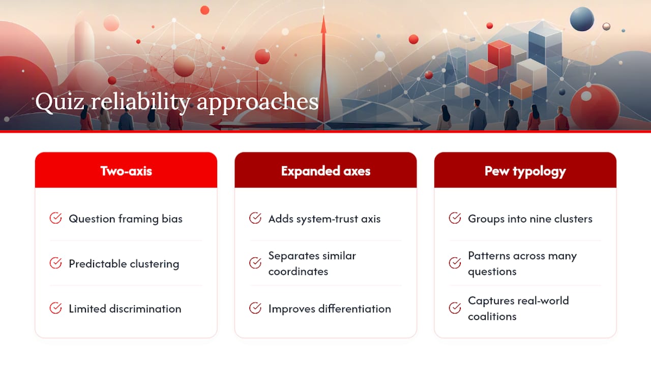
Classic two-axis tests draw consistent criticism for question framing bias. A proposition worded to sound reasonable on one side can push scores in that direction regardless of the respondent’s actual views. FindMyPolitics documents this problem directly, arguing the original Political Compass has framing and discrimination problems that cause respondents to cluster in predictable quadrants.
The clustering effect is well-documented. When a large share of test-takers land in the same quadrant, the test loses its ability to distinguish meaningfully between them. Adding axes like system trust helps, because it separates people who share economic and social coordinates but differ on whether they trust existing institutions to act on those values.
Pew Research’s typology work takes a different approach entirely. Rather than placing people on continuous axes, it groups respondents into nine named clusters based on patterns across many questions. This approach acknowledges that political identity is multidimensional and that clusters often capture real-world coalitions better than coordinates do.
For a broader look at how political views vary across countries and systems, our team’s comparative politics analysis puts individual quiz results in useful global context.
Which political compass test fits your goal?
Pick based on what you actually want to learn:
- Quick quadrant placement — Take The Political Compass. Ten minutes, instant 2D result, easy to share and compare with friends.
- Nuanced self-study — Start with FindMyPolitics (five axes, contextual notes, in-browser privacy). Run the 40-question standard version first; upgrade to 80 questions if you want more precision.
- Cross-country or ideology comparison — Use IdeologyMap. Its country and historical figure overlays make it the most illuminating option for readers curious about where their views sit globally.
- Visual or slider-based experience — Try Votely. The 3D cube and 81-ideology mapping make it the most visually engaging option, and the slider format captures view strength in a way radio buttons can’t.
- U.S.-specific political identity — Go directly to the Pew Research Political Typology Quiz. It’s grounded in real survey data and gives you a named group with detailed American political context.
Time vs. insight: a 10-minute test gives you a useful orientation. A 20-minute deep version gives you something worth reflecting on for weeks. If you only have time for one, the FindMyPolitics standard version offers the best balance of depth and speed.
Our team’s perspective on using these tests well
Our team at Lizard’s Lunch recommends trying a multi-axis test first, then running The Political Compass as a quick cross-check. The multi-axis result gives you texture; the classic two-axis result gives you a reference point that most people around you will recognize.
A few practices we find genuinely useful when interpreting results:
- Compare your scores across at least two different tests before drawing conclusions.
- Pay more attention to the axes where you scored near the center than the ones where you scored at the extremes. Extremes are easy to interpret; the middle is where your real tensions live.
- Read the short ideology descriptions your test provides, then look up one or two that surprised you.
- Talk with someone whose result differs from yours. The conversation is usually more illuminating than the score.
One honest caveat: no online political beliefs assessment replaces reading, conversation, or lived experience. These quizzes are excellent entry points, and they’re genuinely fun, but they’re snapshots, not portraits. Use them to start a conversation with yourself, not to end one. For more politics content and analysis, our team covers a wide range of perspectives worth exploring.
Curious about how your interests connect to other areas of life? Our home renovation guides and lifestyle content on Lizardslunch cover everything from practical home upgrades to tech and travel, all with the same practical, no-fluff approach.
Sources
- Political Typology Quiz: Which of the 9 Groups Are You? | Pew Research Center
- The Political Compass
- FindMyPolitics — Political Compass Test & Alignment Quiz
- IdeologyMap
- Political Compass Test: The Most Accurate 3D Quiz | Votely
Each test links to its own “About” or methodology page where you can review question design and data handling before you start.


















Leave a Comment
Your email address will not be published. Required fields are marked with *